
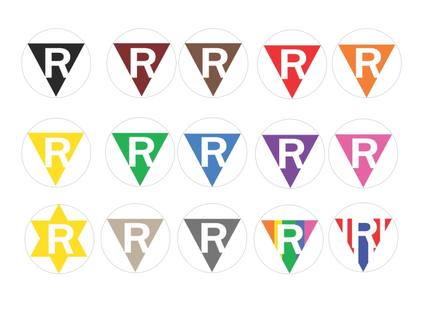
We are all Mexicans
We are all Jews
We are all Muslims
We are all Blacks
We are all LGBTQ
We are all Asians
We are all Indians
We are all Immigrants
We are all Feminists
We are all Americans
We are all Patriots
‘R’
is for Resistance
A ‘Badge’ to Unite All Resistance Movements

We are all under attack- R is for Resistance. Wear it as a badge of honor
Shortly after the presidential election, (November 13) ‘Trump Nation/Whites Only’ was written on the wall outside a majority-immigrant church in Maryland. When things like this happen, there’s two ways to go: quietly wash the wall or stand firm against hatred and promote tolerance.
All citizens of good conscious must join the resistance to Donald J. Trump’s authoritarian administration. To visualize and unite the various resistance groups and present the movement a unifying symbol, we propose that resisters wear a triangle ‘R’ badge on their sleeves when protesting – whether immigrants, refugees, or people of every ethnicity, religion, sexual orientation or political affiliation, to demonstrate their patriotism in the struggle to preserve American democracy.
The design and colors of the ‘R’ triangle-shaped badge are derived from Nazi camp emblems prisoners were forced to wear. By co-opting that horrific emblem, we make a powerful protest against the threat of authoritarian rule and visualize the unity of all resisting groups. We urge all citizens to join the resistance and wear the ‘R’, whenever and wherever they protest the Trump regime policies.

Why the ‘R’ Triangle:

Nazi concentration camp badges, primarily triangles, were part of the system to identify types of prisoners. The triangles were made of fabric and sewn on jackets and trousers of the prisoners. These mandatory badges of shame had specific meanings indicated by their color and shape. Such emblems helped guards assign tasks to detainees: for example, a guard at a glance could see if someone was a convicted criminal (green patch) and likely of a “tough” temperament suitable for kapo duty. Some historical monuments quote the badge-imagery; the use of a triangle being a sort of visual shorthand to symbolize all camp victims. The modern day use of a pink triangle emblem to symbolize gay rights is a response to the camp identification patches.
Shape was chosen by analogy with the common triangular road hazard signs in Germany that denote warnings to motorists. Here, a triangle is called inverted because its base is up while one of its angles points down.
Print your own badge or create a personalized version

Design by Tucker Viemeister. Concept by Len Stein.

love to get feedback on how clear the design is
LikeLiked by 1 person
Oh, sure: R means Resist! Now I’m going to walk down the street and be confused for a Republican, and have to explain. Puh-lease! Great design is like a great joke: no explanation necessary.
LikeLiked by 1 person
LOVE.
LikeLike
Just saw this on the Daily Heller. I will share with our local Indivisible group. If you like our Indivisible logo, I am happy to provide a vector version for your Indivisible group to use with your chapter name underneath. http://www.indivisiblecharleston.com
LikeLike
much appreciated!
LikeLike
Hi Tucker,
I think this is a good starting point. However, there are some things that need improvement in your presentation. I showed this to an Asian colleague and she pointed out that you are missing Asian and Islamic and Arabic in your color selection (considering our current political situation, this is a serious misstep). You also have two pendants/patch designs for Jewish people. While the Star of David makes historical sense, it doesn’t fit into the unifying triangle motif. It seems like it might make sense to include the Star of David over or under the “R” on the triangle instead.
LikeLike
thanks- is a work in progress and improvements will be made soon
LikeLike
I commend your effort to create, post and share this. As an artist, I plan to spread the orange emblem with my fellows. Kudos to you for taking such initiative. May it spread widely. Cheers!
LikeLike
This is such a loaded symbol. Doesn’t this movement deserve its own unique design rather than trying to co opt an item so closely tied with the holocaust?
LikeLiked by 1 person
thanks! We are all in the struggle together.
LikeLike
how to I download one to print?
LikeLike
we’re working on it. what format would you like?
LikeLike
What about WOMEN as a category? Remember the Women’s March just last month? We are a major force of resistance, and a unifying force for resistance. Women’s health issues are in serious jeopardy. If we’re dividing ourselves into factions, WOMEN should certainly be one. On the other hand, I think it would be more forceful to unify under a single color.
LikeLiked by 1 person
maybe woman are coopting the pink one?
LikeLike
Dezeen ran a story
http://tinyurl.com/kh8jkp2
LikeLike
It’s reminiscent of the ACT UP! Logo from the ’80s, which used the pink triangle to advocate for AIDS awareness and action. Visually, the leg of the R unbalances it a bit
LikeLike
Please do not use these Nazi brands as resistance symbols. I am a Jewish queer woman. I grew up seeing my grandparents shy away from any symbols denoting our difference because of the markings depicted here. They gave me Jewish star necklaces that transformed into butterflies with a pull so I could hide myself if needed, because branding ourselves, in their mind, meant death. I don’t believe I need to hide, but my grandparents’ fear displays how traumatizing this imagery is. You are not changing or co-opting the art in exchange for positivity. You are using Nazi ideas of design for division under the guise of unification in a way that does not function in its current iteration.
Thank you for trying to communicate the need for common symbols. However, as a designer, I can tell you: good design need not be explained. It explains itself. The fact that you need this article to dilute the agony of the Nazi imagery for my people and others like my family who survived the Holocaust serves to illustrate that the current design does not suffice.
LikeLiked by 1 person